
 Omnisend AI

 OFFER

One of those brands is Bluffworks, which makes technical travel apparel that doesn’t look technical. In this Marketing Playbook, the Shoelace team shares a campaign they see as a clear example of that approach in action: a restock email for Bluffworks’ best-selling Ascender Chino, where a single, review-led layout change lifted revenue by 40%.
Read on to see the strategy behind it, the exact Omnisend setup, and how to apply it to any product your customers buy more than once.
The strategy: match the click to the real decision
The idea started with Bluffworks’ customers, who rarely stop at one pair. In the brand’s reviews, 274 Ascender owners mention coming back for another color or another pair. So when the Ascender came back in stock alongside a new color, Desert Sage, Shoelace set out to test a simple question: does it matter how you let a returning customer pick their next color?
“Most restock emails just say ‘it’s back.’ Our customers already knew the product inside out. What they needed was the easiest possible way to pick the next color,” says Jordan O’Neil, Email/SMS Marketing Manager at Shoelace.
Shoelace sent the restock email to 16,034 past Ascender buyers and A/B tested one module.
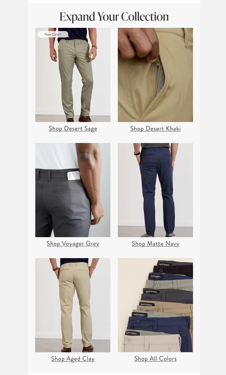
Version A, the color grid: five named colors, with the new Desert Sage first, plus Shop All Colors. Each tile opened the product page with that color already selected.
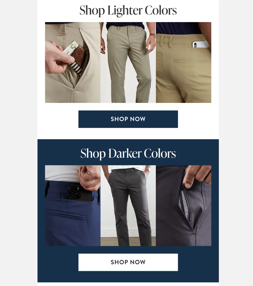
Version B, the light/dark split: two blocks linking to collection pages.
Results
The send reached 16,034 past buyers with a 48.4% open rate and generated $17,314 from 74 orders, or $1.08 per recipient (about 6x Bluffworks’ account median). Opens and clicks came out identical, but the version that made every color its own clickable tile earned $2,903 more from the same number of recipients.
| Color grid (A) | Light/dark split (B) | Lift | |
|---|---|---|---|
| Open rate | 48.1% | 48.6% | Tie |
| Click rate | 4.8% | 4.8% | Tie |
| Orders | 39 | 35 | +11% |
| Revenue | $10,109 | $7,206 | +40% |
| Revenue per recipient | $1.26 | $0.90 | +40% |
| Units ordered | 72 | 47 | +53% |
| Units per order | 1.85 | 1.34 | +38% |
| Distinct products ordered | 29 | 21 | +38% |
Why the grid won
- Fewer steps, bigger carts. Landing with the color already picked left one job: choose a size and add to cart.
- Seeing every color invites collecting. Named colors side by side prompt “which two?” thinking, while a light/dark split frames it as either/or.
- More cross-sell. Product-page landings gave related-product modules more to work with.
- The right audience. A curated grid is quick to scan for someone who already knows their fit. Cold traffic would likely need more guidance.
“Opens and clicks tell you whether the email worked. Units per order and product spread tell you whether the layout worked. Look at both,” says Jordan.
The playbook
To run the same color-grid campaign that Shoelace built for Bluffworks, do the following.
1. Pick a repeat-purchase moment
Choose a reason to email past buyers about a product they already own: a restock, a new colorway, or a product returning after a supply gap. Pent-up demand helps. Bluffworks paired the Ascender restock with the launch of a new color, Desert Sage, which gave the email a natural headline.
2. Segment past buyers of the product
Build the audience from order history, not engagement. In Omnisend, create a segment of contacts who have placed an order at least once where the line item title contains the product name.
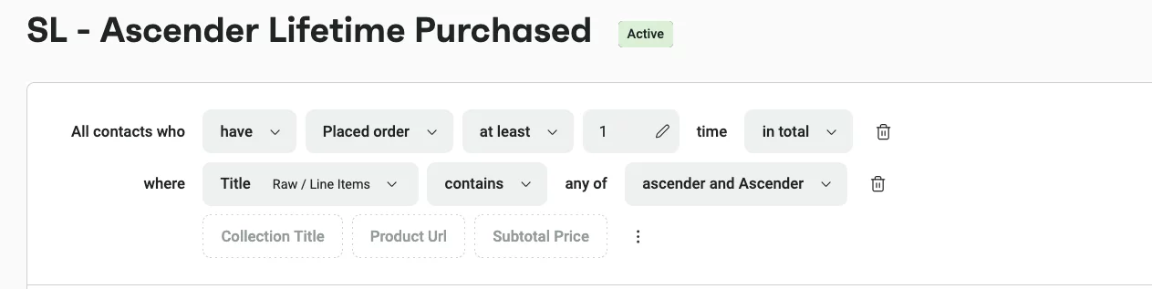
Pro tip: If you’d rather not email people who just bought, add a condition that excludes anyone who ordered the product in the last 30 to 60 days.
3. Mine your reviews before you write
Export your reviews and filter to the product. Shoelace filters to five-star reviews between 40 and 320 characters, the range where customers say one clear thing. Then search for the theme you plan to lead with and count how many reviews support it. If the count is thin, change the angle. Pull one short verbatim quote to use in the email.
“We treat the review base as our research department. If customers aren’t already saying it, we don’t build a campaign around it,” says Jordan.
If you also run paid ads, check which creative angle is winning there and which search phrases convert. They’re email angles that have already been tested with real money. Shoelace uses them as a second check, with reviews as the main source.
4. Write the copy as a scenario
- Subject line: for past buyers, clarity beats cleverness. They know the product, so name it and say what’s new – “Ascender Restock + New Color.”
- Preheader: add the practical detail that removes a reason to wait – “Shipping has resumed on all orders.”
- Hero: names the product.
- Body: short, with one customer review and one clear call to action.
Translate features into what they mean in real life. For Bluffworks, “wrinkle resistant” becomes “ready straight from your bag.”
5. Build the email in modules
Stack the email as a hero image, a short subline, the color grid, one or two supporting modules, and the review. Bluffworks’ supporting modules featured shorts and the chino’s hidden zip pocket.
6. Build the color grid as individual tiles
This is the step that made the difference:
- Create one tile per colorway, plus a Shop All tile.
- Put the color name under each tile. Names carry more intent than swatches.
- Link each tile to the product page with that color preselected in the URL. Don’t link tiles to a collection page.
- Lead with what’s new, then order the rest the way customers usually buy. Bluffworks put the new Desert Sage first, then Desert Khaki (the most common first pair) and Voyager Grey (the most common second).
7. A/B test the body only
In Omnisend, set up an A/B test campaign. Keep the subject line, preheader, and hero identical so the only variable is the layout. Split 50/50 and send both versions to the full segment, rather than using a small test group with an automatic winner. The difference shows up in revenue and basket size, not clicks, so an auto-winner picked on opens or clicks would miss it.
8. Report on what happens after the click
Compare revenue per recipient, average order value, units ordered, and distinct products ordered by version, not just opens and clicks. In the Omnisend campaign report, the Order performance section lets you switch between Version A and Version B to see products ordered and units ordered for each.
9. Roll the winner forward
Use the winning layout in your next multi-color moment and run one confirmation test before making it your standard.
Tips from the agency
Here are Shoelace’s tips for getting the most out of a color-grid campaign:
- Keep the offer constant. The grid works with or without a discount. Bluffworks’ test ran with none, so the lift came from the layout alone.
- Use a review count as a go/no-go. Shoelace rewrote one campaign angle that only 27 reviews supported. Another, with 157 five-star mentions, became a campaign.
- Name the colors on the tiles. “Voyager Grey” carries more intent than a grey swatch.
- Order tiles with purpose. Lead with what’s new, then follow with the buying order or go light to dark. It keeps the choice concrete while nudging shoppers toward a light-and-dark pair.
- Let the sender name carry the brand, so your subject line and preheader can focus on the reader’s moment.
- Give the test a long enough attribution window to catch the second order. Version A’s 36 buyers placed 39 orders inside the window.
- Set up a custom link-tracking domain before comparing sends, and note the date it went live. Click rates can jump when it changes, which makes older campaigns look worse by comparison.
- Borrow angles that already won elsewhere. If an angle is converting in your ads or search terms, it’s a pre-tested email angle. Start there, not from a blank page.
The layout is a creative decision, and creative is where the incremental results come from. We test structure as often as we test subject lines.
Who can use this strategy?
- Brands with variant products and repeat buyers. Anywhere a returning customer picks a variant rather than a category, this works: apparel colors, coffee roasts, skincare shades, supplement flavors, paint colors, or sock packs.
- Small and large lists alike. A brand with a few thousand past buyers of one product can run this as a straight send without testing. Larger lists can A/B test layouts and measure basket effects with confidence.
- Brands building a review base. Early-stage brands should collect reviews first. The review-mining step is what keeps the copy honest and the angle grounded.
It works less well for first-time prospects. They haven’t formed a preference yet and usually benefit more from grouping and education. The mechanism depends on the audience, not the product.
About Shoelace agency
Shoelace is a Canadian DTC growth agency founded in 2015. It runs email, paid social, organic social, and creative as one connected system, so an angle proven in one channel gets adapted for the next instead of copied.
Shoelace’s approach to email starts with the review base as its research department. Every campaign begins with what customers already say, gets written as a scenario rather than a product pitch, and gets measured on revenue per recipient and basket behavior.
The agency works with brands in apparel and accessories, beauty and skincare, food and beverage, and outdoor and lifestyle goods.
Want to work with Shoelace? Click here to get started.